In the dynamic world of online marketing and engagement, webinars have emerged as powerful tools for businesses and professionals alike. However, hosting a stellar webinar alone is not enough. To ensure your event reaches its full potential, you need a meticulously crafted webinar landing page.
A landing page is a single web page that serves a specific purpose within a broader online marketing or advertising campaign. It’s designed to prompt visitors to take a particular action, such as signing up for a newsletter, downloading an e-book, registering for a webinar, or making a purchase.
Landing pages are typically stripped of distracting elements and navigation menus to focus the visitor’s attention on the primary call-to-action. They are an essential tool in digital marketing for driving conversions and capturing leads, as their simplicity and focus make it easier to guide visitors toward the desired goal.
In this comprehensive guide, we will look into the intricacies of creating the ultimate webinar landing page, combining insights from industry statistics and practical strategies to maximize conversion rates.
Importance of a Well-Designed Webinar Landing Page
In the realm of digital engagement, where first impressions hold significant importance, the significance of a meticulously crafted webinar landing page cannot be overstated. It’s the virtual doorstep to your webinar, the place where potential attendees make their crucial decision to enter. This section looks into why a well-designed landing page is the backbone for success, offering insights supported by industry statistics.
- First Impressions Matter: The saying “you never get a second chance to make a first impression” holds true for webinars. A well-designed landing page is equivalent to a virtual handshake, making a memorable first impression that entices potential attendees and significantly boosts conversion rates by up to 23%.
- Reflects Webinar Quality: Just as a fine wine deserves an elegant glass, your high-quality webinar deserves an equally impressive landing page. A poorly designed page can inadvertently convey doubts about the webinar’s quality, potentially dissuading potential attendees. In fact, 38% of users will stop engaging with a website if the content or layout is unattractive.
- Builds Credibility: Trust is the currency of the digital realm. Accordingly, a landing page meticulously designed with professionalism and clarity builds credibility, establishing your authority in the subject matter and nurturing trust with potential attendees.
- Increases Engagement: A visually appealing and user-friendly landing page is the gateway to increased engagement. Users spend an average of 5.94 seconds looking at a website’s main image, so captivating visuals are crucial. Therefore, its design and structure should be enticing enough to keep visitors exploring, ultimately leading them to register.
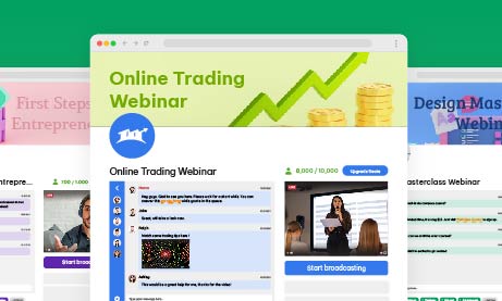
Pageinar: Your All-in Webinar Landing Page
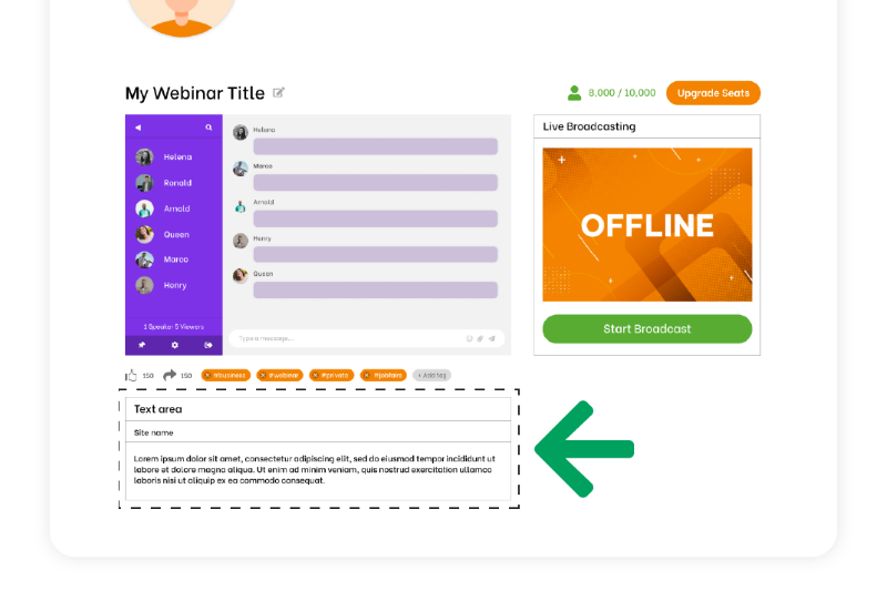
Pageinar is a versatile landing page platform that empowers you to effortlessly tailor your content, seamlessly integrate broadcasting, and incorporate chat rooms, all while maintaining a user-friendly and straightforward interface for your audience.
Through the platform, you can create a one-to-many broadcast and use it for webinars or live streaming. The chat room serves as a bridge for two-way communication between the streamer and the audience. In addition, there are moderation and customization tools that can assist in enhancing user experience.
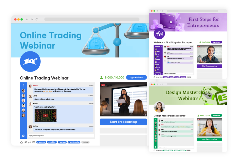
As a new and upcoming platform for webinars, Pageinar serves to give their users the all-in webinar landing page. There’s no need to start from scratch. Pageinar is already pre-made with a theme, which you can adjust according to your preferences. Once you’re satisfied with your copy and how your elements look, then you can start broadcasting your webinar.
Key Elements of an Effective Webinar Landing Page
Every great webinar landing page is a combination of key elements carefully calibrated to capture attention, drive engagement, and spur registrations. To navigate this landscape successfully, it’s essential to understand the fundamental building blocks that constitute an effective landing page. Here, we will also explore these crucial elements and their pivotal roles in the conversion process, backed by data-driven insights and how you can achieve this with Pageinar.
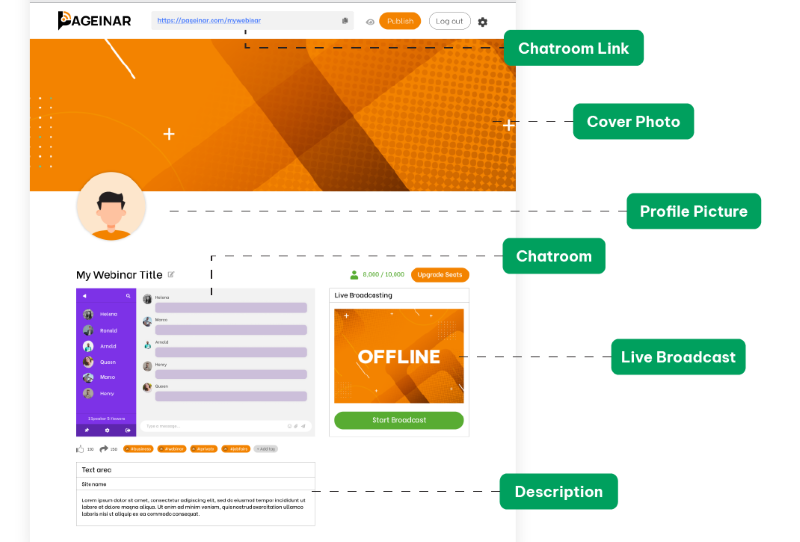
- Attention-Grabbing Headline: Your headline should be a beacon, guiding visitors toward registration. Moreover, a clear and concise headline that conveys the webinar’s value succinctly can be the difference between a quick exit and a registration. In Pageinar, you can create a webinar title that will capture your audience’s interest with one look.
- Compelling Copy: Your copywriting skills will be put to the test here. According to research, companies with 30+ landing pages generate 7 times more leads than those with fewer than 10. Persuasive, benefit-driven copy that crisply communicates the advantages of attending the webinar is paramount in convincing potential attendees to commit their time. Through the Site Description box, you can add text that will highlight the importance of your webinar, the current topic, and other information that is needed to understand your webinar.
- Eye-Catching Visuals: As humans, we are naturally drawn to visuals. Through high-quality images and videos, you can transform your landing page, making it more visually enticing and fostering greater engagement. With Pageinar, you can choose themes that will make your webinar enticing. As the landing page is also straightforward, your audience will not be confused with all the elements on your page. It’s simple and beginner-friendly for anyone who wants to create a webinar with a landing page.
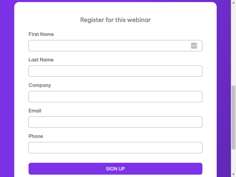
- Registration Form: Simplicity is key when it comes to registration forms. The shorter and more user-friendly the form, the higher the likelihood of potential attendees taking the plunge and registering. In fact, reducing the number of form fields from 11 to 4 can increase conversions by 120%.
Pageinar has a simple registration form. There are many ways to register such as:
- Social media
- New user registration
For these, email and password are needed. That’s all there is to it. So, there’s no need to input contact numbers, addresses, etc, unlike other registration forms.
Design and Layout Considerations for your All-In Webinar Landing Page
The visual and structural aspects of your landing page are more than aesthetic choices; they are the silent architects of user experience. This section discusses design and layout considerations, highlighting the importance of consistent branding, a clear hierarchy of information, judicious use of white space, and mobile responsiveness. Furthermore, we also share statistics on why these aspects can’t be overlooked.
Consistent Branding
Cohesion is key. Ensure your landing page aligns seamlessly with the branding of your webinar, creating a unified and polished online experience. Accordingly, a consistent presentation of a brand has been shown to increase revenue by up to 23%.
Clear Hierarchy
Establish a clear hierarchy of information on your landing page, ensuring that visitors are guided logically through the registration process. Users spend an average of 5.59 seconds looking at a website’s written content. Therefore, critical information should stand out prominently.
White Space
Don’t underestimate the importance of white space. A clean and uncluttered layout can make your landing page look inviting and easy to navigate. It can also increase comprehension by 20%.
Mobile Responsiveness
With mobile users accounting for 52.6% of website traffic, optimizing your landing page for mobile devices is essential. Fortunately, Pageinar is optimized for mobile devices to guarantee a seamless user experience across all platforms.
Optimizing Content for Conversion
Content is king, especially in the digital realm, but it’s not just about the quantity; quality reigns supreme. In this segment, we uncover strategies for content optimization that emphasize benefits over features, leverage social proof, create urgency, and champion simplicity. Then, we’ll back these strategies with compelling statistics that reinforce their effectiveness.
- Highlight Benefits: Shift the focus from features to benefits. Outline the tangible benefits attendees will gain from the webinar, showcasing how it will address their pain points and provide solutions. Benefits-focused content can also boost conversion rates by up to 31%.
- Use Social Proof: Incorporate testimonials or social proof to bolster credibility. In addition, real-life success stories and endorsements from previous attendees can be powerful persuasive tools.
- Create Urgency: Utilize scarcity tactics or limited-time offers to infuse a sense of urgency. FOMO (Fear of Missing Out) can be a compelling motivator for potential attendees to register promptly.
- Keep It Simple: Keep your content simple and easy to understand. 94% of visitors cited web design as the reason they mistrusted or rejected a website. Make your content straightforward and accessible, avoiding jargon or technical terms that might alienate potential attendees.
Call-to-Action (CTA) Strategies
The ‘Register Now’ or ‘Join Us’ button may seem simple, but its role is paramount in guiding visitors towards action. This part of our guide explores the nuances of effective CTA strategies, from clarity and prominence to action-oriented language and the strategic placement of multiple CTAs. Data-backed insights reveal the impact these tactics can have on conversion rates.
Clear and Prominent CTA
The CTA should be prominently displayed and impossible to overlook. Its language should also be action-oriented, encouraging visitors to register immediately. Using a first-person CTA like “Register Now” can increase conversion rates by 90%.
Use Action-Oriented Language
Craft CTAs that employ action-oriented language, compelling visitors to take that crucial step toward registration.
Multiple CTAs
Don’t rely on a single CTA. Scatter multiple CTAs strategically throughout the landing page to reinforce the message and opportunities for conversion. Moreover, multiple CTAs provide additional touchpoints to reinforce the primary message and value proposition of your webinar. Visitors may not be convinced by a single prompt, but when they encounter CTAs at various points on the page, it reinforces the idea that the webinar is worth attending.
Continuously test various CTAs and optimize your landing page based on user behavior and conversion rates. Data-driven decisions can significantly enhance effectiveness. Regularly testing different CTAs and optimizing based on user behavior can improve your landing page’s effectiveness. A/B testing has been shown to increase conversions by 49%.
A Walkthrough of Creating an Ideal Landing Page
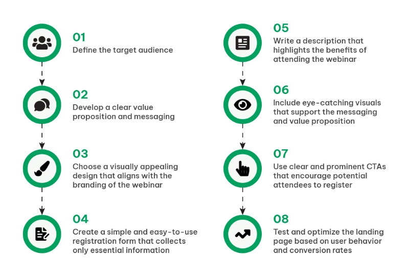
To bring it all together, let’s embark on a practical journey through the creation of an ideal landing page. This section provides a step-by-step walkthrough, from defining your target audience and crafting a compelling value proposition to selecting a design, streamlining registration forms, writing benefit-driven content, incorporating visuals, and strategically implementing CTAs.
Step 1. Define the Target Audience
Thoroughly understand your target audience’s needs and preferences. Understanding your audience goes beyond demographics; it’s about grasping their pain points, goals, and what drives their decisions. Look into data analytics to segment your audience effectively. Identify where your potential attendees hang out online, their browsing habits, and what topics resonate with them. Then, utilize data to create detailed personas that guide your messaging and content.
Step 2. Develop a Clear Value Proposition
Craft a compelling and unique message that communicates why your webinar is a can’t-miss event. Your value proposition should be concise, yet compelling. Dive deep into the benefits your webinar offers. Statistics also show that webinars focusing on solving a specific problem or providing actionable insights tend to have higher registration rates. Furthermore, use A/B testing to fine-tune your value proposition’s wording and presentation for optimal impact.
Step 3. Choose an Appealing Design
Select a visually pleasing design that harmonizes seamlessly with your webinar’s branding. Design is your silent ambassador. Conduct A/B tests with different designs to understand what resonates with your audience. In addition, use heatmaps and user testing to see how visitors interact with your page. With Pageinar, you can also incorporate responsive design principles to ensure that your landing page is accessible and engaging across various devices.
Step 4. Create a Simple Registration Form
Streamline the registration process by collecting only essential information, reducing friction. Lengthy registration forms can be off-putting. Data supports that shorter forms lead to higher conversion rates. For instance, collect only essential information initially, such as name and email. You can gather more data post-webinar or during the nurturing process. Additionally, consider using social login options, which can increase conversions by simplifying the process.
Step 5. Write Benefit-Driven Content
Emphasize the real-world benefits attendees will accrue from your webinar, ensuring they understand the value proposition. Craft content that speaks directly to the pain points of your audience. Statistics reveal that headlines emphasizing solutions or benefits perform better than generic ones. Use storytelling to illustrate how your webinar can transform attendees’ lives or businesses. Then, include data-backed insights and case studies to substantiate your claims. Remember, the focus should be on what attendees will gain.
Step 6. Incorporate Eye-Catching Visuals
Utilize images and videos that reinforce your messaging and grab the visitor’s attention. Visuals play a pivotal role in holding visitor attention. Test different images and videos to see what resonates. Research indicates that video content can significantly boost engagement. Ensure that your visuals align with your messaging and highlight key points. For instance, infographics are an effective way to condense complex information into digestible visual formats.
Step 7. Implement Clear CTAs
Ensure your CTAs are clear, action-oriented, and well-placed, guiding visitors toward registration. Moreover, CTA buttons should be prominent and easily distinguishable. Research reveals that CTA buttons with contrasting formatting tend to perform better. Test different CTA copies, such as “Register Now,” “Save My Spot,” or “Join the Webinar.” Implement urgency tactics like countdown timers if applicable. Moreover, use A/B testing to find the most effective CTA placements.
Step 8. Test and Optimize
Regularly monitor user behavior and conversion rates, allowing data to guide your improvements and enhancements. Various tools can also provide invaluable insights into user journeys. Analyze bounce rates, time spent on the page, and drop-off points in your registration process. Test various elements, from headlines to CTA button colors, and use data to guide your decisions. Moreover, optimization is an ongoing process, ensuring your landing page continues to perform at its best.
Understanding why the Structure of Landing Pages is Important
One cannot overstate the significance of meticulously designing a landing page. It serves as your digital stage, the platform where you engage, persuade, and ultimately convert your audience. This process transcends the mere amalgamation of text and imagery; it represents a strategic fusion of art and science.
Therefore, understanding your target audience is pivotal. To craft a compelling value proposition that deeply resonates, you must intimately acquaint yourself with their needs and preferences. The design of your landing page should not only be aesthetically pleasing but also seamlessly aligned with your webinar’s brand identity.
Nonetheless, this journey is an ongoing one, characterized by constant analysis and optimization. Monitoring user behavior and conversion rates yields invaluable insights, which, in turn, inform improvements and enhancements.
As you embark on the creation of your ideal webinar landing page, remain mindful of its dynamic nature. The digital landscape and audience preferences are in constant flux. So, embrace data and analytics as your compass, ready to adapt and refine continually. This endeavor extends beyond a single webinar; it encompasses the cultivation of a brand and the nurturing of a dedicated community.
By adhering to the fundamental steps in this guide and staying attuned to the ever-evolving digital environment, you are on your way to constructing landing pages that not only fill webinar seats but also engage, inspire, and cultivate profound connections with your audience. Landing pages like Pageinar are not mere entry points; they represent the opening chapter of a compelling narrative that you are set to unfold. Thus, convey it with finesse and let your webinars radiate with brilliance.